Addressing an Envelope With Jillian Schiavi Of Jilly Ink
We are so smitten with Jillian Schiavi of Jilly Ink Modern Lettering & Illustration's work that we asked her to show us a few of her favorite ways to address an envelope! Below, she'll show you how to create beautiful designs using Gelly Roll pens. Follow her #write_on journey on Instagram: @jillyink. - Sakura Of America, Egg Press, & Hello!Lucky
Hello letter writing world out there! It’s such a distinct pleasure to be joining the lovely and creative teams of Sakura of America, Hello Lucky!, and Egg Press on the Write On adventure. I’m joining you from sunny Oakland, CA, and I have the honor of sharing a few ideas and tips on how to dress up the post you’ll be sending out all month long. As a freelance lettering artist, I work a lot with envelopes. They’re amazing, little mini canvases that can be used in so many different ways, and at the same time, vitally important in carrying the precious cargo contained within. Today I’ll be focusing on a couple fun and helpful topics:
- How to incorporate patterns and simple illustrations onto the front of your envelopes to liven things up.
- How even the slightest pop of differentiation can seem bold in the eye of the receiver.
- Some useful information to keep in mind (a la the post-person) when it comes to addressing envelopes .
First up – patterns and illustrations!

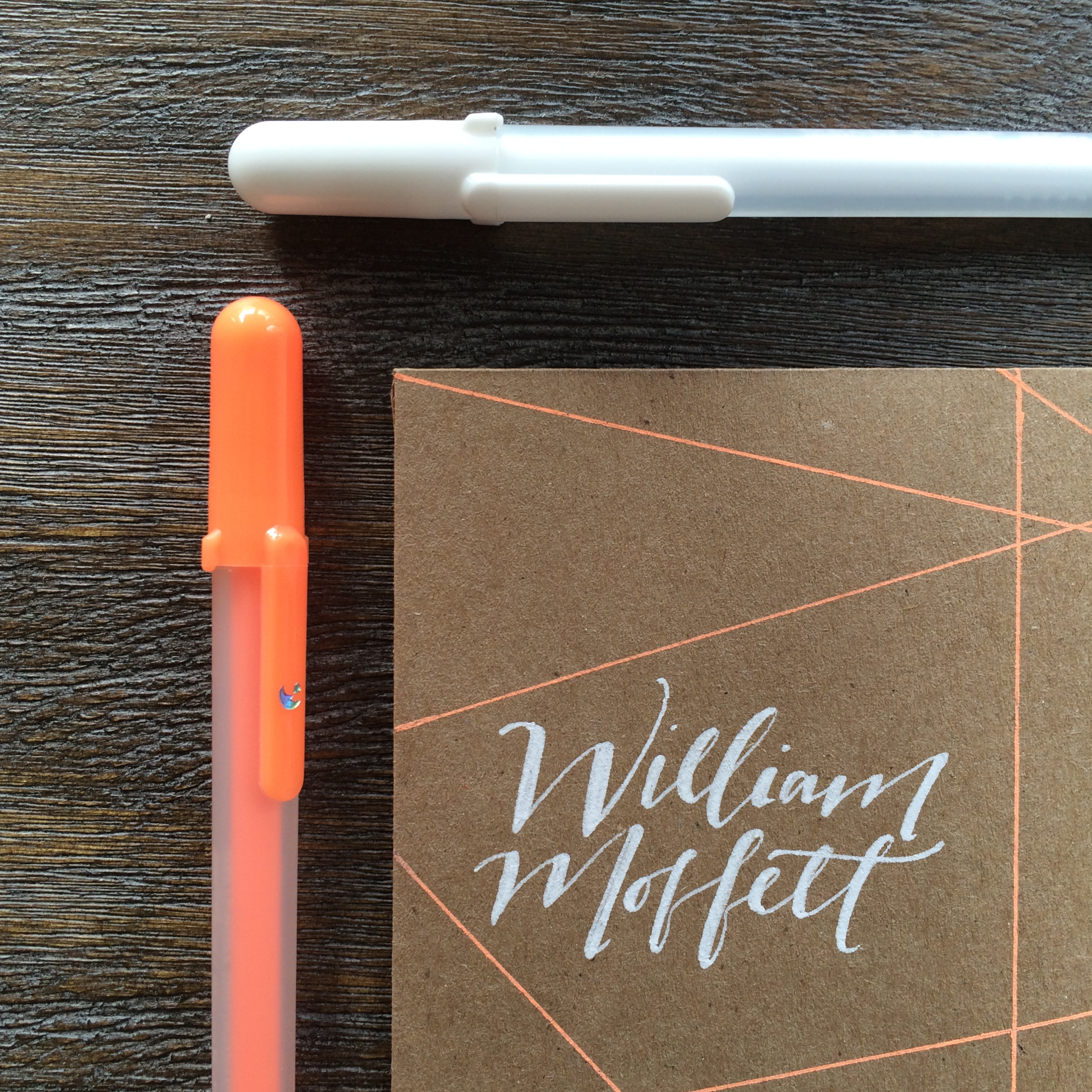
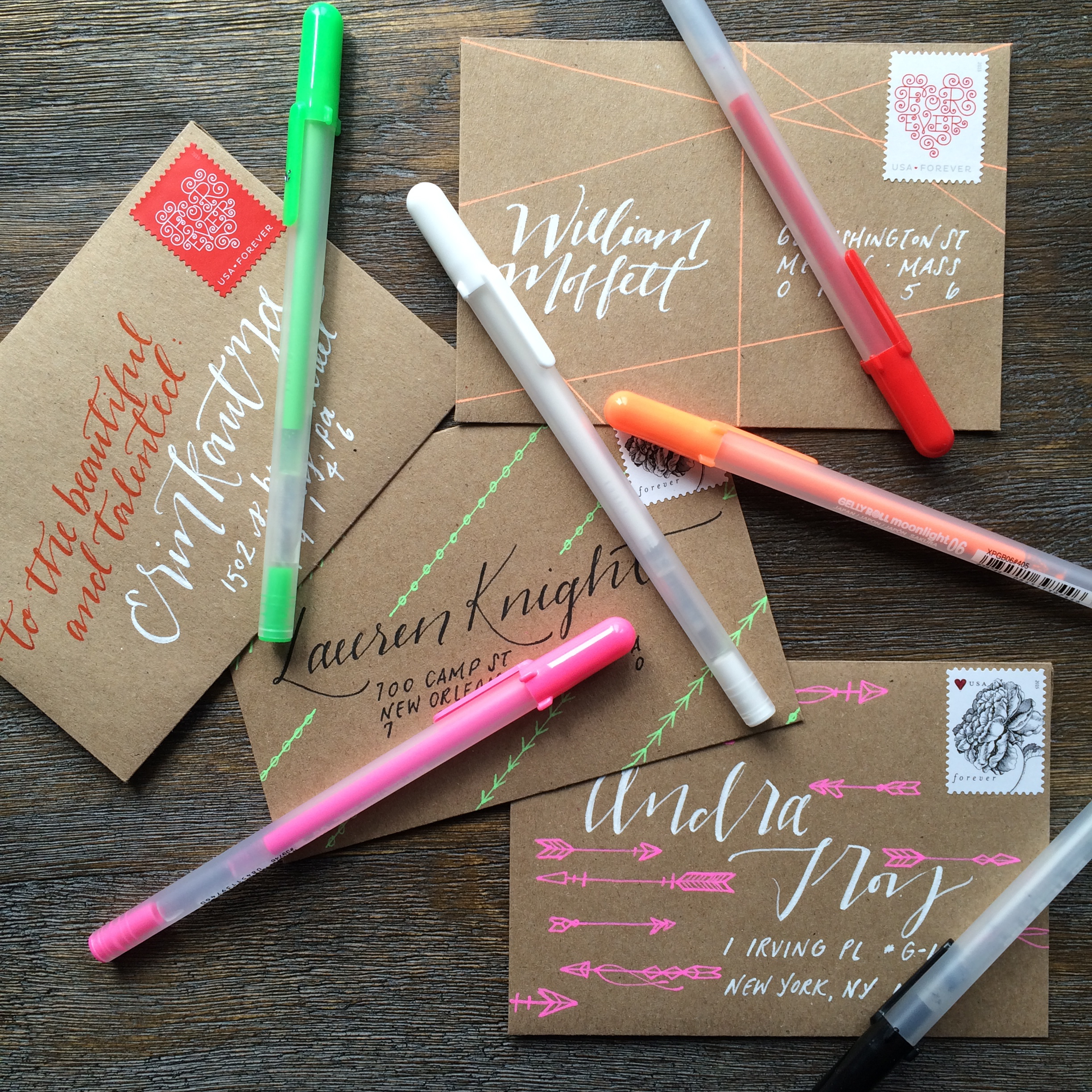
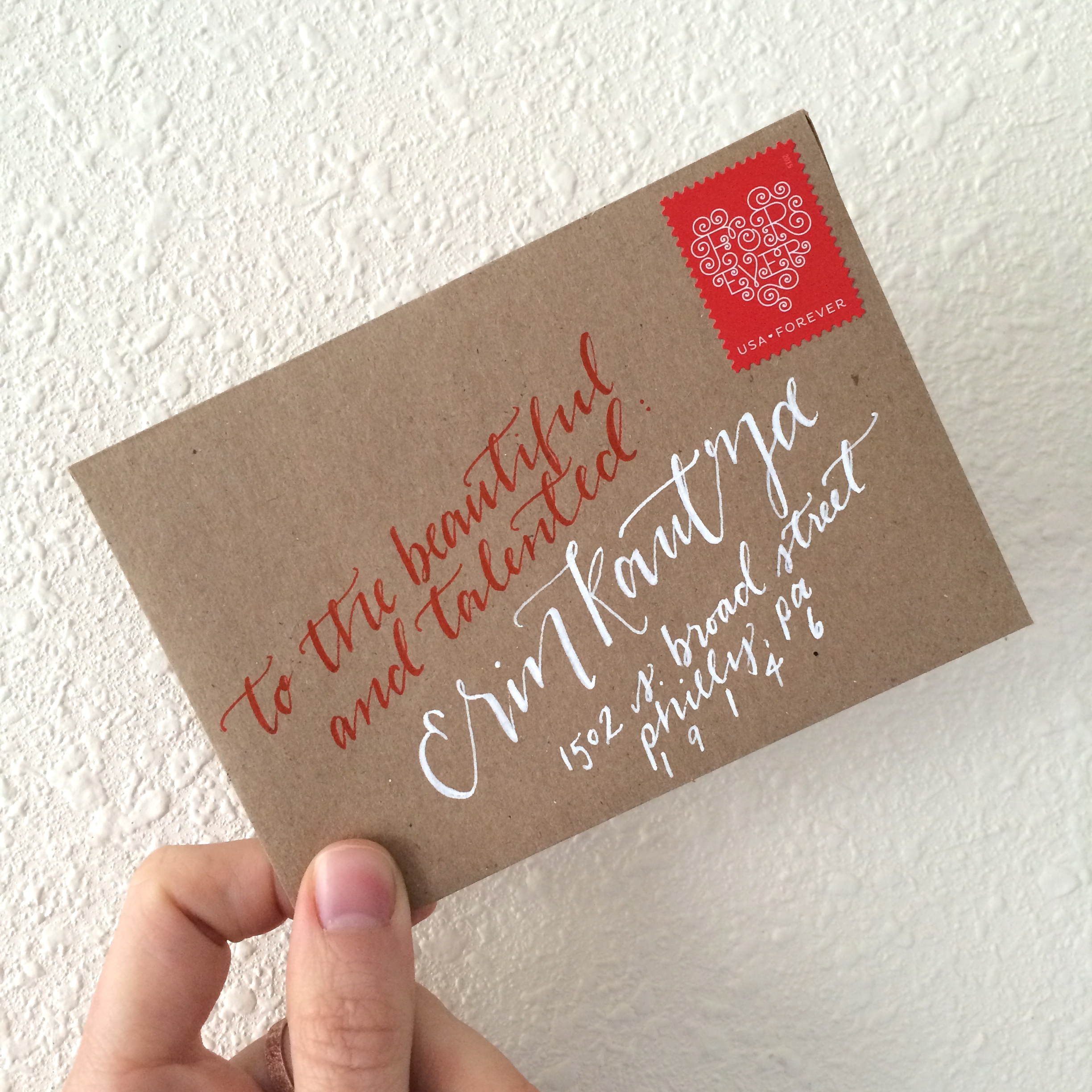
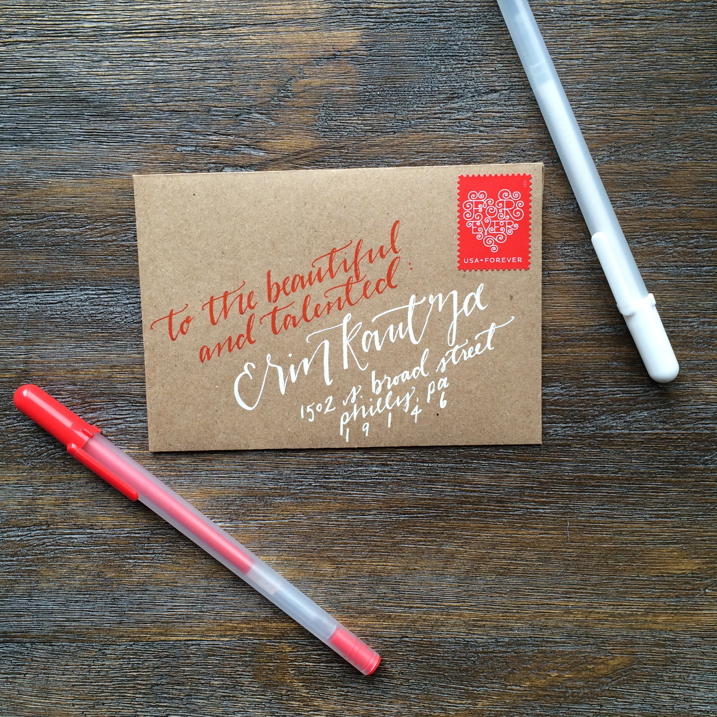
I love the integration of simple line drawings or shapes to emphasize lettering on the front of an envelope. Even something as easy as a few strategically placed straight lines can break up the space beautifully, and allow for a more geometric look. When designing this envelope, I spaced out where the name and address would go first, decided on a lettering style (a combination of script for the name and print for the address is always a good take), and completed that first. Then I took my handy right angle ruler and went to town on outlining the address with a few – not too many – overlapping straight lines. Using the Moonlight Gelly Rolls really adds that extra pop, especially when emphasized by the boldness of white ink.
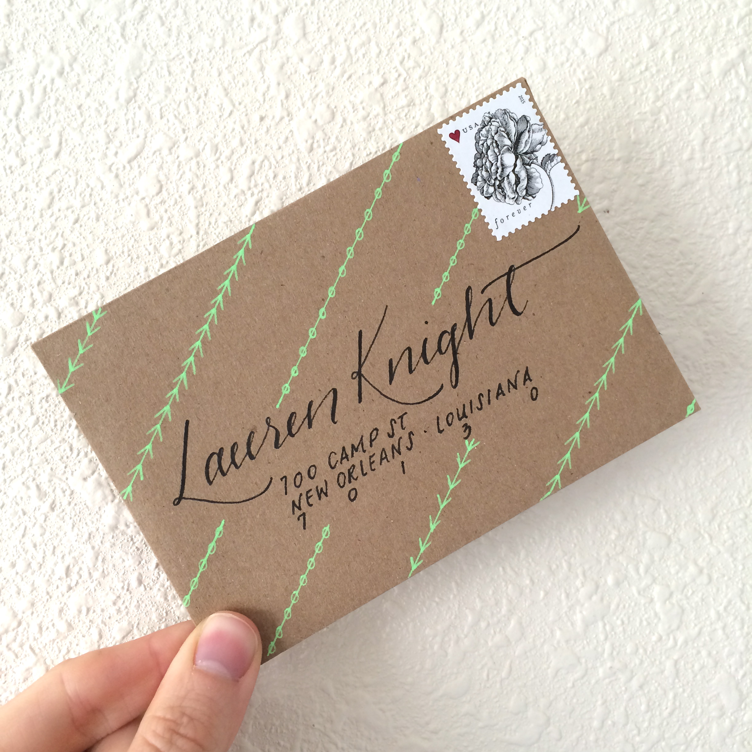
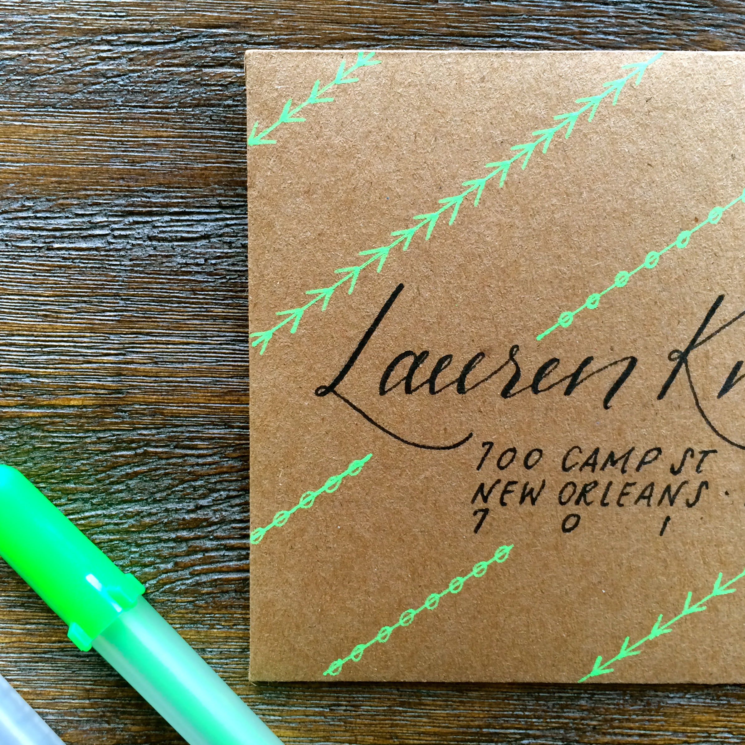
Another really simple way to bring life to more traditional lettering styles, and especially if you want to ensure that your mail is making its way to its intended recipient, is to add bright patterns around a black inked address. I think simple and concise patterns, with consistent angles and sizes, work really well in highlighting some thoughtful and beautiful lettering.

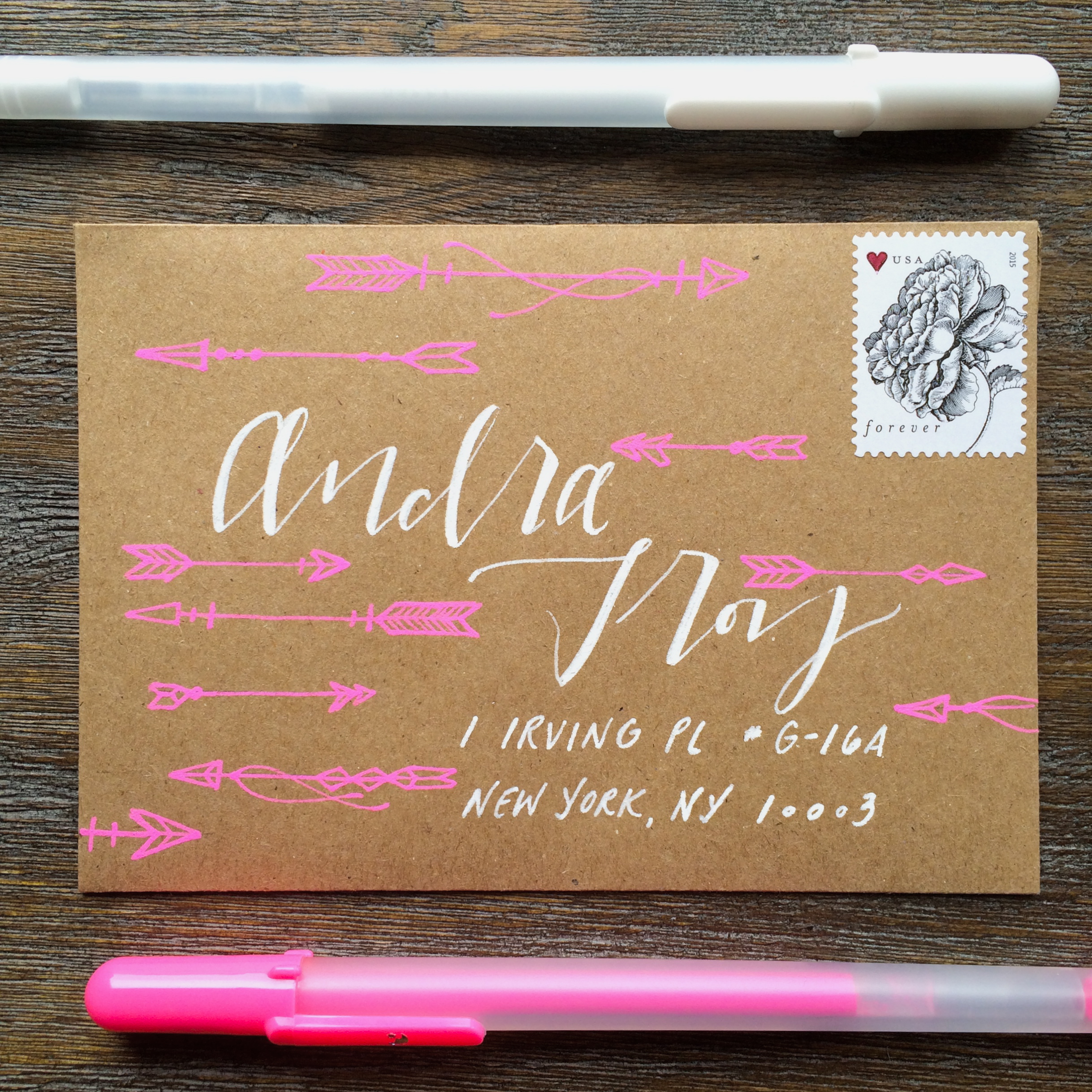
If you’re a bit more ambitious, spending some time on simple and fun illustrations is another way to beautify the front of your envelopes. I recently drew a really interesting tattoo for a client of mine that used a few different arrow styles, and I thought it would be great to utilize those illustrations on an envelope. For this one, I drew most of the arrows in pencil first, keeping a blank space near the middle of the envelope for the name, and a blank space near the bottom right corner for the address. Then I included the lettering for the address, again using a combination of larger script for the name, and smaller, tighter print for the address. I finished it off by drawing over my initial sketches with the hot pink Moonlight Gelly Roll, adding a few extra details, and when everything was nice and dry, erasing the pencil marks. Voila! Instant tiny artwork.
Some other really simple and effective ways to create that pop of attention on the front of an envelope:
- Choose a color palette that works well together – a muted or neutral with a bold and bright is always a winner
- Add an extra line of text to the ‘to’ column on the envelope. Let your recipient know just how you feel about them from the moment they get their mail
- Differentiate the size of the lettering on the front – big name/small address
- Play around with the placement of the address – it doesn’t always have to live centered, right beneath the name. As long as it’s in a format as one unit, it works!
And finally, here are a few tips from our friends at (and my experience with) the USPS:
- Brighter colors tend to have a harder time passing through the scanning machines. If you want to use a more neon palette, consider lettering the name in a bright color, and keeping the address in a more neutral tone.
- Always always always keep the zip code and the street/apartment number legible. Oftentimes we can get away with a more liberal approach on lettering, but if the post person can’t read your zip code writing, it’s most likely getting sent back your way
- Place the stamp first! I have definitely had moments of designing a beautiful envelope, only to realize that the stamp would end up covering half the person’s last name. It’s much easier if you create accurate boundaries first, so do yourself a favor and put the stamp on first (You can always peel it off if you make a spelling mistake).
- Try not to get too busy. If there’s too much on the front, the scanning machine may not be able to pick up where the actual address is. A good rule of thumb is to keep any patterns/illustrations surrounding the address, and not within. And most importantly, have fun! Experiment! If anything, the person on the receiving end probably hasn’t found anything in their mail aside from bills and a bi-monthly New Yorker in a long time, so they’ll be thrilled with whatever they get from you. Happy letter writing, and I can’t wait to follow more of your progress with the #write_on campaign.
Cheers!
Post by Jillian Schiavi of Jilly Ink Modern Lettering & Illustration for #write_on.